
Executive dashboard, hub with dedicated reports per component, and per-campaign behavior analytics.
Every report answers a concrete question of the program and suggests a decision: who to intervene with, which area is worst off, how you stack up against the sector, and how long the organization took to react to an attack. All integrated in the platform.
Request a demoOpens, clicks and completion rate measure content consumption, but they don’t answer the questions that need to be answered every week to run the program:
The reports suite is designed to answer these questions and let the program advance based on evidence.
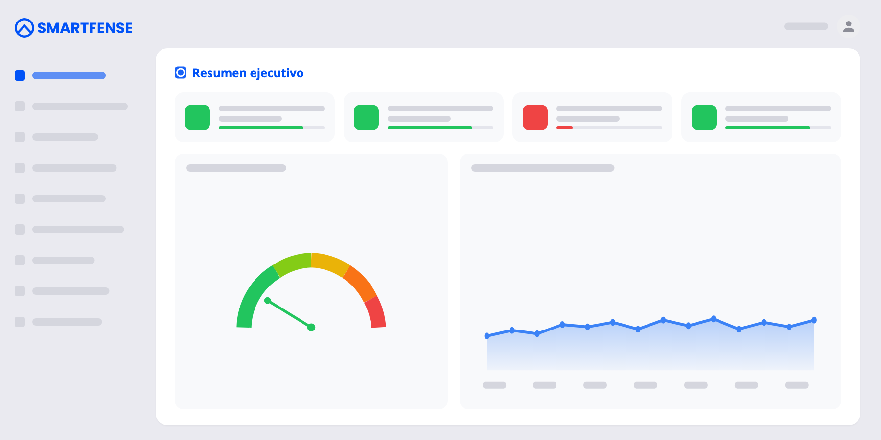
The platform’s home page summarizes the state of the program. Four key traffic-light indicators (assigned users, completion rate, reporting rate, proactivity rate), an organizational risk gauge with monthly evolution, and direct drill-down to every report.
Below, three blocks that guide day-to-day work: prioritized recommended actions (pending configuration, overdue training, referrers to recognize) that can be marked as resolved and reappear if the situation changes again, priority users for intervention with direct access to the profile, and upcoming campaigns with the last one shown as a funnel.
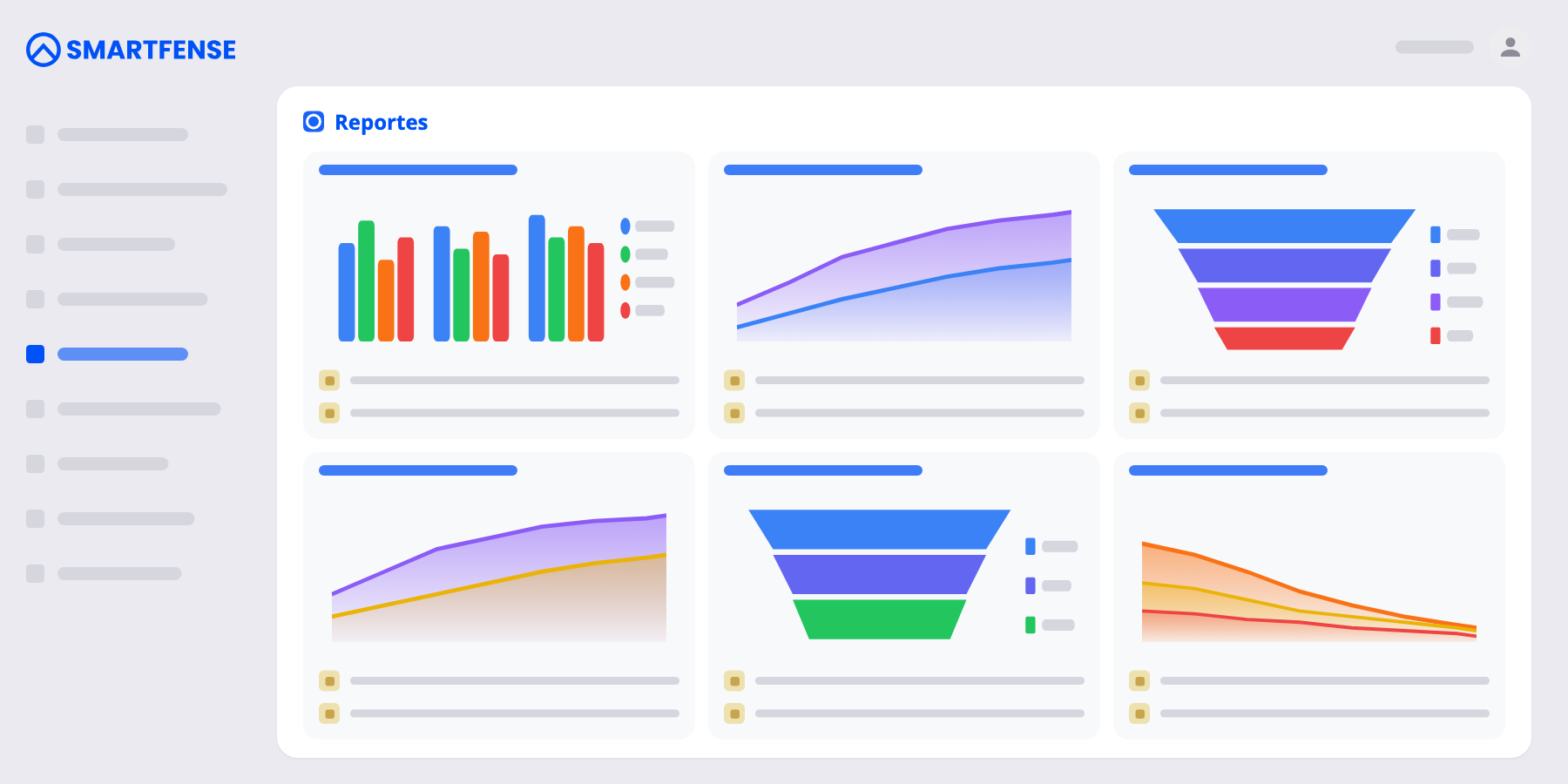
Reports organized by purpose. Each card answers a concrete question, distinguishes activity inside campaigns from proactive activity, and appears only if your organization has the component contracted.
Program KPIs separated by origin —inside campaigns and self-initiated—: reach, participation, completion, and resilience. Includes the Awareness Benchmark, which compares your results against the rest of organizations, global and by sector, anonymously and aggregated (“you outperform X% of organizations”).
Dedicated analytics for Modules, Videos, Videogames, Newsletters, Phishing, Smishing, Ransomware, USB Drop, Exams, and Surveys. Interactions over time, percentage distribution, consolidated analysis of all campaigns in the period, proactive use, and each component’s own benchmark.
Who uses the platform on their own —and, above all— who doesn’t. What part of the catalog gets consumed voluntarily and which relevant content nobody opens. And the status of assigned training, with filters by due date and days overdue, person by person.
360° user profile that integrates risk, resilience, simulations, training, and proactive activity. Comparison across areas, levels, and groups. Prioritized list of users to intervene with and awareness referrers to recognize.
Also included: analysis of reported emails with Smart Triage —automatic classification of what users report via the phishing button, with risk level and analysis detail—, gamification rankings, and the correlation report across components.
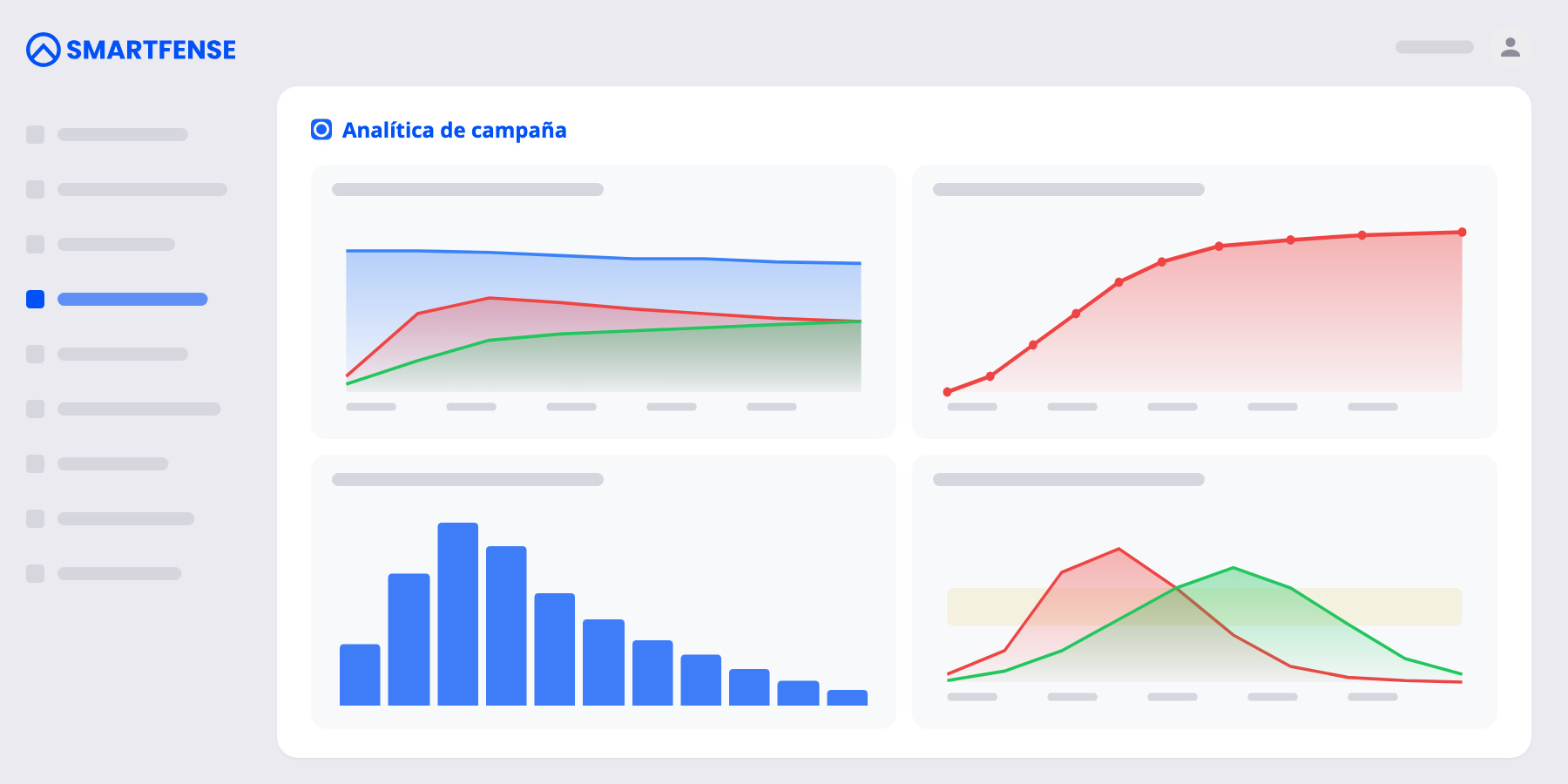
Each campaign detail includes behavior charts that complement the funnel and adapt to the component type. Not just how many fell or completed, but how fast and with what pattern.
In attack simulations, the cumulative fall curve and the exposure window show how fast the organization falls vs. how fast it reports. They measure how long the attack stayed active before someone reacted.
A histogram distributes users by how long they took to fall since receiving the simulation. It distinguishes the impulse click, in the first seconds, from the fall after hesitating: two risk profiles that need different reinforcement.
Time to first use of the device: how long the risk of a malicious USB stays active in the premises before someone plugs it in, opens it, or executes its content.
Time to completion and progress against the due date: the actual completion curve against the pace required to reach 100% on time. Anticipates whether reminders will be needed before the deadline.
In exams: status, score distribution against the pass threshold, attempts per person, and correct answers per question. Questions with the lowest hit rate mark the concrete concepts to reinforce in the next action.
Comprehension validation in newsletters and videos answers whether the message was understood. In videogames, score distribution and leaderboard show performance and feed gamification.
All charts share a consistent semantic coloring: green for positive, red for negative, blue for in progress, and gray for no activity. It reads the same way across any component.
Every report answers an explicit day-to-day question and suggests a decision.
01 · PROGRAM LEAD
Knows who to intervene with first, with the signals to understand why (risk trend, recent falls, overdue training) and direct access to the user’s profile. The Monday morning work queue.
02 · CISO
A single risk gauge with monthly evolution, comparison of areas and groups, and benchmark against the sector to answer “how do we compare to the rest?”. An executive snapshot ready for the next committee.
03 · PLATFORM ADMINISTRATOR
Integration alerts and recommended actions that get marked as resolved and reappear if something changes again. Health dashboards to monitor nudge delivery, false positives in simulations, and the execution of Playbooks.
04 · PARTNER
Multi-organization portfolio dashboard and benchmark against the sector to support the client with concrete evidence. Reporting that reinforces the value of the recurring service.
We’ll show you the full reporting with real data from an instance and answer the specific questions of your program.